Logos
Easily download our logo files for various uses. Please ensure you read our guidelines at the bottom of the page to understand how to display the logo correctly and uphold our brand.
Easily download our logo files for various uses. Please ensure you read our guidelines at the bottom of the page to understand how to display the logo correctly and uphold our brand.
This is the identity that envelopes the entire Surpass brand.


Full colour, white background – recommended and compatible for most uses.
Full colour, transparent background – ideal if a transparent background is required.
White, transparent background – for use on dark backgrounds.
Various logo files for advanced users – includes .pdf, .eps and .ai vector file formats.
Please take a minute to read this guidance and ensure you use the logo correctly to maintain our brand.
Our logo forms an important part of our brand identity. It allows consumers to instantly recognise us and associate us with certain values. Consistent logo usage is important to uphold brand value and ensure our visual identity remains clear and professional.
To ensure all elements of the logo are large enough to be visible, the minimum height the logo should be is:

The logo should be surrounded by a minimum area of space. This isolation area ensures that edges, text and other visual elements do not encroach on the logo. The area is defined by the height of the ‘a’ in ‘Surpass’.

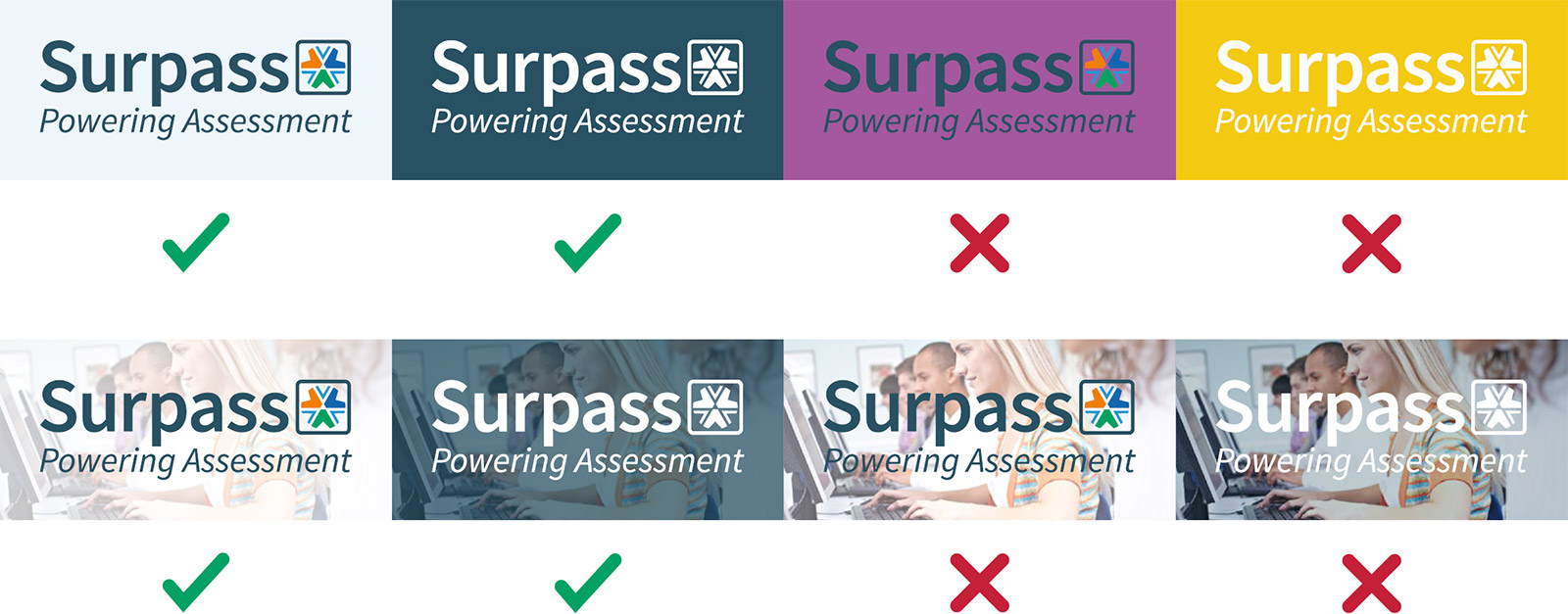
The logo is usually on a white background, however it can be placed on a pale, unvibrant background provided it stands out and has enough contrast. For darker backgrounds, the logo can be used in white.
Photo/Illustration backgrounds are acceptable provided they are darkened/lightened so that the logo has enough contrast.
The appearance of the logo must remain consistent. The logo should not be added to, redrawn, cropped, adjusted or modified in any way. It should only be reproduced from the artwork provided.
